
Community
The Paper Energy Collective
Logo & Brand Design
paperenergycollective.com
The Paper Energy Collective’s mission is to build community through vibrant storytelling, showcasing stores that are as diverse as the people they hail from. Jenn, the owner, reached out for help creating a visual identity that radiated trust and creativity. She was looking for a design that was clean, fun, and brimming with energy!
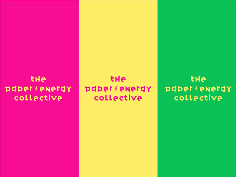
Channeling my inner 1970’s funk, the primary logo is a combination of a clean layout, a simple lightning icon & quirky lettering. I used the Variex font which proved to have the right balance of legibility and playfulness. Jenn was very clear that she wanted vivid brand colors, so I utilized a vibrant pink, green, & yellow. To reinforce the brand’s creative flow, I developed a freeform gradient version of the logo and to top things off, I created a social icon featuring a custom disco ball adding a little eccentricity to the brand.
Jenn loved the final product so much that she recruited me to design the company website and additional marketing material!


